Project Overview
When I started at Buildertrend, I kicked off my journey with the Core Job Management team, diving into user challenges within the product's core features. As I was faced with these challenges, I began to recognize issues in the design and development process that turned out to be pretty common among my colleagues.
For example, it wasn’t always clear what components were common versus what components were custom to a specific feature. Sometimes I would use a component from our Figma library and the developed design wouldn’t match what I had mocked up. I talked about this with developers I was working with and learned they were building some elements of my design custom because what existed in the Figma library didn’t match what existed in the development Storybook library. With every mockup they faced a decision; build this new version of component that looks similar to something they already had in their storybook? Or use what's available in the Storybook and not match the design?
I soon learned that the practice of building new versions of components was more common than the usage of the ‘common’ components that existed in Storybook. From a developer perspective, seeing variations of components that almost matched Storybook had become so commonplace that developers had formed a habit of building new one-off variations, so there wasn’t ever any reason to question why any given mockup's components didn’t match the Storybook. This practice resulted in a lack of any true 'common' components in Storybook.
Our design documentation, consisting of lightweight annotations in file, was not always clear about the properties of a component, or what was possible with a component versus what was not. Due to this lack of guardrails, designers would make slight tweaks to components that they believed resulted in the best UX, especially considering their past experience and understanding that developers would try and build whatever for them; a sort of vicious cycle spurred by good intent on both sides.
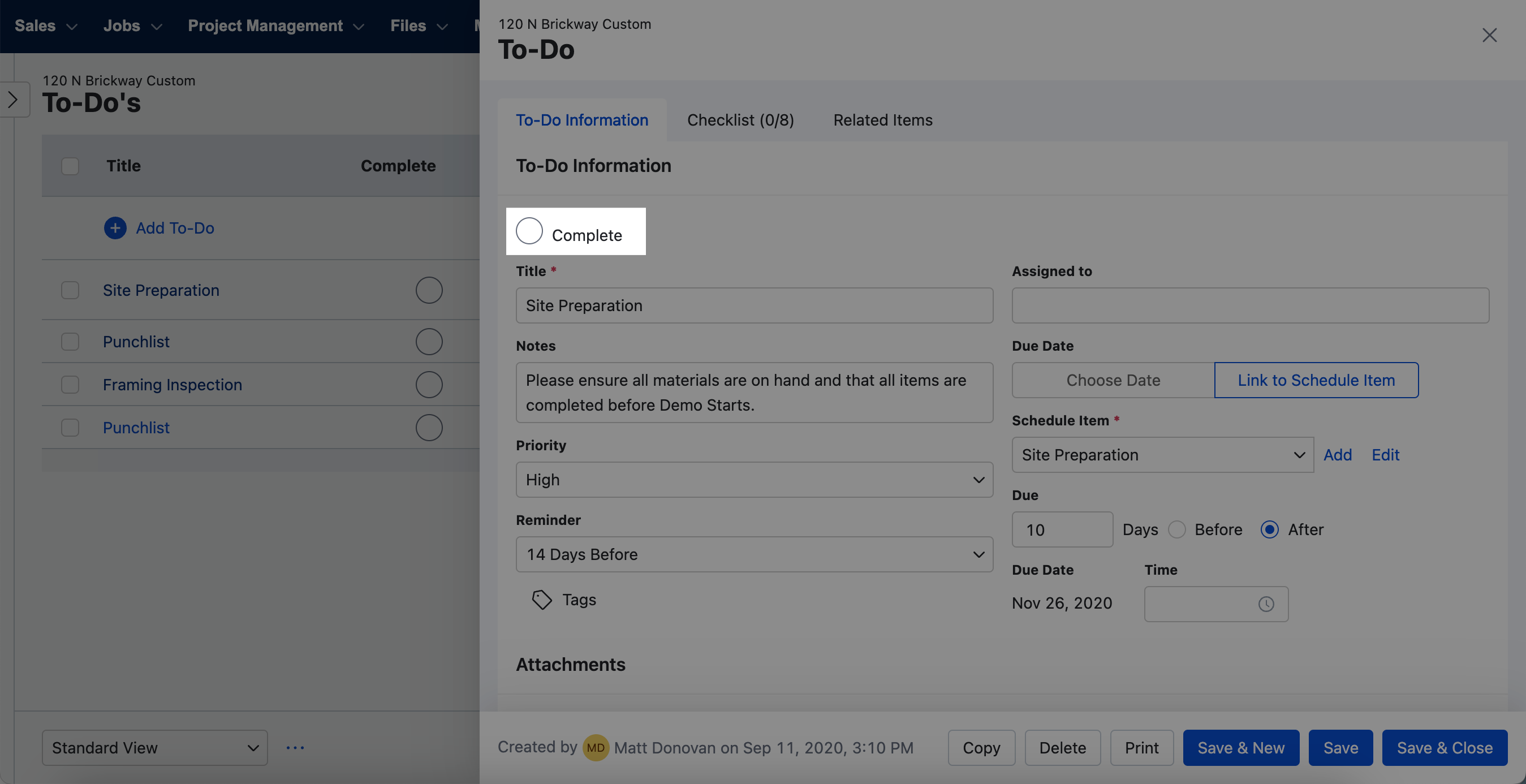
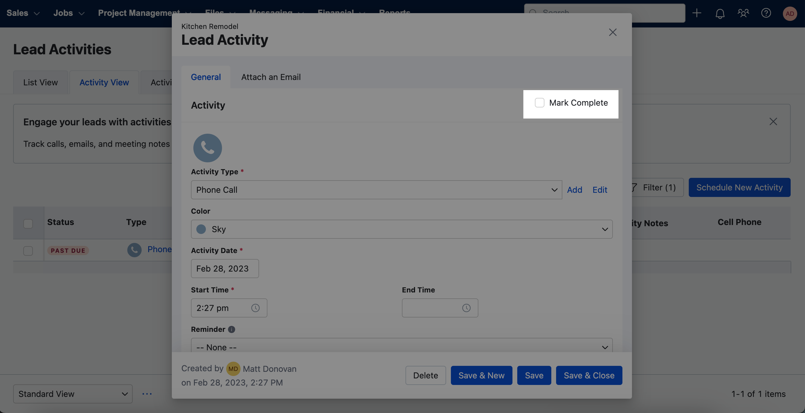
While maybe producing good results in a vacuum, the result of this pattern was an application riddled with arbitrary inconsistency without intent. On every other screen, you’d find a slightly different version of a component that had no reason to be different. And worse, in research reports on churn numbers, you’d find that one of the paramount reasons we lost subscriptions was due to the feeling of being overwhelmed. My gut told me that the minor differences in common elements, components, and layouts acted as paper cuts, keeping new users from getting comfortable and realizing value in the software.
Fortunately after 10 months of working in Job Management I had the opportunity to come work on the Blueprint team, where they were building Buildertrend’s new design system. I realized I had a chance to be the change I wanted to see at Buildertrend. I could work on a design system that I believed could improve our internal design and build process, and in turn improve the consistency and quality of the experience for Buildertrend’s end users.
Great, lets build this thing!
When I joined the team I was excited to see that they had already begun component design work, reconsidering everything from tokens and atoms to navigation and layout abstraction. Naively I wondered “How quickly can we get this into production, I think the refreshed, tidied aesthetic in addition to the thought put into consistent layouts and components will solve so many user problems!” only to learn we did not yet have a development team assigned to our team (the same company re-org that allowed me the opportunity to join this team was still in process).
Our team soon realized we would be waiting for developers to join our team longer than expected. It also became clear that some stakeholders outside of design had concerns about the investment needed for a design system and didn’t see the current ways of working, or the lack of a true design system as a problem.
I was surprised and wondered how they could think the current way of building wasn't a problem. After all, everyone I worked with in design seemed to experience the same issues I had and agreed about the problems with inconsistency in the application. We realized we needed to paint a picture of the ground floor for those who were not experiencing it firsthand.
A two-pronged approach
We approached the need to address the outlined sentiment with a two-pronged approach:
First, we gathered examples in the app demonstrating inconsistency with no intent. Essentially auditing the application for examples of design debt.
(add examples)
Simply gathering examples of poor UX alone would not be enough to convince anyone a design system is the solution. We needed our stakeholders to understand how a design system would solve the designer/developer experience, which would trickle down to solving those customer-facing problems. They needed to understand how teams created an application with objectively poor UX. We needed to collect a qualitative understanding of internal experiences.
To move forward we spun up information-gathering workshops with all of the different groups of folks in product engineering, divided up by their expertise (PMs, Developers, QAs, Designers). We simply asked them to tell us about their pain points related to the current system of design, development, and testing. They came to us with problems and solutions and we found some themes.
Problem Themes:
The design and development libraries don’t match, causing confusion.
Teams don’t clearly understand how components should be used.
Designers aren’t sure of the process to modify or add components.
Teams modify, misuse, or create duplicate components causing issues and confusion.
Solution Themes:
Bring design and development libraries into sync
Build out great documentation that’s accessible to all
A single team takes responsibility and ownership of building and maintaining global components
Develop and promote a clear process for modifying and adding global components.
We presented this information, and by taking this two-pronged approach, keeping our evidence as straightforward as possible through clear examples of poor UX and following those examples with explanations of how we got there from the collective horse’s mouth; it was hard to argue with. We gained buy-in from the uncertain stakeholders, and they now agreed there was indeed a need to solve the problems laid out by the folks we interviewed internally, and without us having to say it the solutions they came up with pointed to what is essentially a design system. We were provided developers resources and we we're given a runway to move forward with the design system.


Winning hearts and minds
We presented this information, and by taking this two-pronged approach, keeping our evidence straightforward, providing clear examples of poor UX and following those examples with explanations of how we got there; it was hard to argue with. We gained buy-in from the uncertain stakeholders, and they agreed there was indeed a need to solve the problems laid out by the folks we interviewed internally, and without us having to say it the solutions they came up with pointed to what is essentially a design system. We were provided developers resources and we we're given a runway to move forward with the design system.

Get In Touch
This project is in progress. Check back here in the coming months if you want to see what I find! And If you want to receive updates regarding this project, send me a message and I will make sure to keep you posted.